
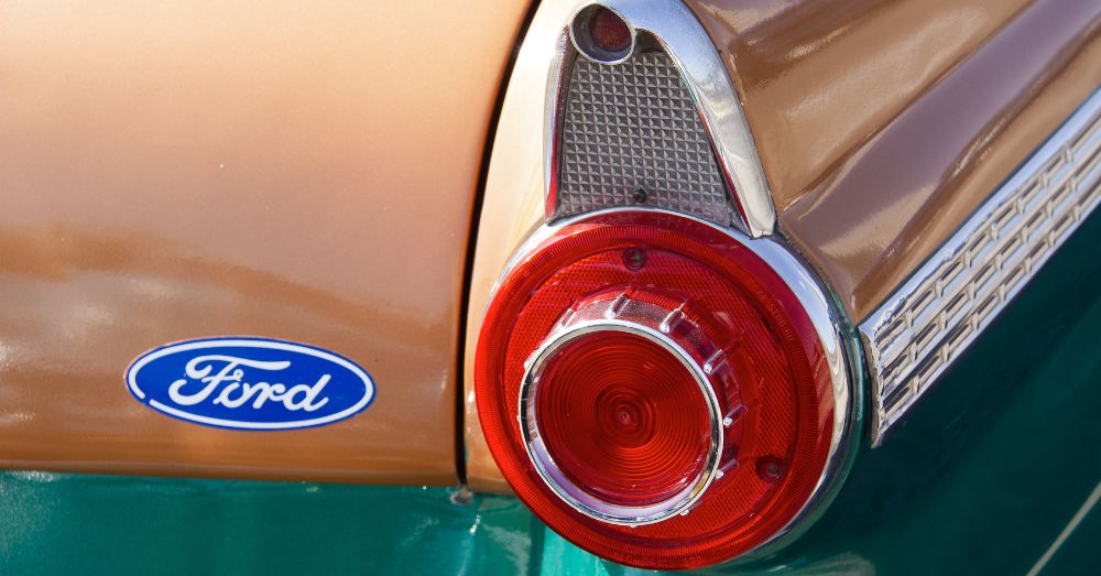
Ford has used various versions of its famous logo for over a century, but as much as we think we know it, a strange detail has escaped most people’s notice. A viral TikTok asked viewers to identify the correct version of Ford’s logo. One choice included an elaborate flourish on the letter F, while the other did not. Which one was right?
Side By Side Comparison
To many people, the fake Ford logo looked more real than the real Ford logo. Thanks to present-day corporate bland branding, the flourish on the F seems unlikely and fake. However, it’s actually been there since the 1910s. You can easily confirm this by looking at a vintage ad from the Henry Ford Museum.
Some commenters on the viral TikTok correctly identified the real Ford logo, including someone who worked at a Ford dealer and a Ford mechanic. However, most regular folks should also be able to identify the real Ford logo correctly. After all, the Ford F-150 has been the longest-running best-selling vehicle in America, and Ford ads are regularly seen on TV.
How Ford’s Logo Originated
The logo was designed by C. Harold Wills, who was a Ford engineer and letterpress printer. He was inspired by the company founder’s signature, but at the same time, it’s not an exact copy. Ironically, Ford’s signature did not include the flourish on the F. However, ornate script logos were very popular back in the early 1900s. For example, look at the Coca-Cola logo.
Despite the trend toward sans-serif fonts into the modern age, Ford’s logo has survived basically intact, with the flourish on the F. In 1966, legendary designer Paul Rand created a new Ford logo with a modern look and without the script appearance. He presented it to Henry Ford II, but the latter decided against it because he thought it was too radical.
Script Font and Blue Oval
If you close your eyes and imagine the Ford logo, you probably see the famous blue oval and the overall script design. However, other details are a bit hazy, and you might not remember them exactly. This is totally normal. Many studies have shown that people aren’t very good at recalling logos because our brains don’t store unnecessary information unless we consciously choose to remember it.
A few other famous logos are also hard to recall. Most people can’t remember whether the leaf tilt or the bite out of the Apple logo is on the left or the right. It’s also not easy to remember whether the Fruit of the Loom logo includes a cornucopia. If you’re wondering, the Apple details are on the right and the Fruit of the Loom has the contents and shape of a cornucopia, but not the actual horn.
In other words, the minute details of the Ford logo aren’t pressing or interesting enough for most of us to remember easily. We see a blue oval with a script font and that’s about it. However, if you look more closely, you might be surprised.
Related Posts

5 Most Unreliable Used Cars
Shopping for used cars can be a great way to…

And it Can be Yours for Only…
Auction sites are pretty cool with ways for you to…
Shelby Doesn’t Just do Mustangs
For years Shelby has been a partner with Ford to…